Thanks Rick.
What do you do then, do you recommend Cleartype off then when using your apps?
Thanks in advance....
>>Rick, isn't Tahoma a TrueType font?
>
>Yes it is but if a control is overlaid or hovered over when it's bold, the bold smears with Tahoma (or any other ClearType font). It's very ugly.
>
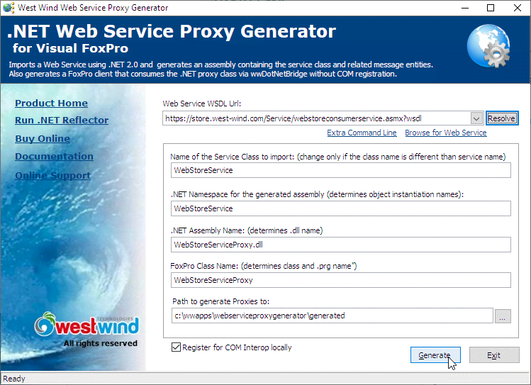
>You can see it in this image:
>
West Wind Proxy Generator Screen>
>Look at the extra Command Line parameter which smeared when the drop box popped up over it..
>
>Here it happened on non-bold text, but with bold text there are more instances where the blurring occurs (usually labels for me). Same issue in Help Builder, Message Reader etc.
>
>It's a FoxPro rendering engine bug related to ClearType. If I turn ClearType off in Windows then I don't get this behavior.
>
>+++ Rick ---
>
>>
>>Or are you saying the same is also true of any ClearType font in addition to Tohoma Bold?
>>
>>>Same here...
>>>
>>>I do have issues with bold text though on Windows 8+. Bold text will get out of focus and 'blotch' on grey backgrounds with Tahoma (or any ClearType font) which seems is a bug in the way VFP is doing it's font rendering...
>>>
>>>Anybody else have this issue?
>>>
>>>+++ Rick ---
>>>
>>>>We are using Tahoma (size 8) for many years now and it does not look outdated yet, so we are very happy with that decision. It's very readable and does not look as common as Arial. Also it uses relatively little space, while some fonts may use more space and that can be a problem when you have to put longer words on a label and you don't like to resize the entire form. For that reason I would never use Verdana.
>>>>
>>>>>I could use a little advice on this one. I am updating a older VFP 7 app to VFP 9. I have been reviewing some info by Doug Hennig on Font selection for Windows 7, etc.
>>>>>
>>>>>Since we are now firmly in a Windows 7 and Windows 8 world, is it better to move to using Segoe UI (as Doug suggested), or has that now changed since Windows 8?
>>>>>
>>>>>I don't think Segoe UI is a truetype font, and that kind of bothers me. My concern is I don't want Microsoft to make a change to something that will knock all my forms out of allign.
>>>>>
>>>>>What if someone turns off cleartype?
>>>>>
>>>>>Any thoughts and suggestions are appreciated....


